

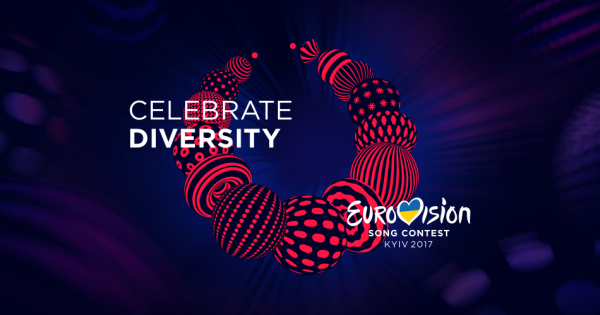
The creators of this year’s Eurovision logo have won a prestigious design award for their work on the project. Despite fans thinking it looked like something else, the logo was based on a traditional Ukrainian necklace.
The brand of Eurovision has won the Best of the Best award in the Communication Design nomination at the prestigious Red Dot awards. This was a joint project of the Banda Agency and Republique. News of the win was published on the collaborators official facebook page yesterday.
This year’s logo was based around a traditional Ukrainian bead necklace called Namysto. This is a protective amulet and a symbol of beauty and health. It is made up of many different beads, each with its own design and individuality.
The slogan Celebrate Diversity instantly divided opinion amongst fans. It was criticised as people felt that Ukraine was not a country that celebrated diversity, and some even compared the logo to anal rings.
What is the Red Dot?
The Red Dot are prestigious awards to celebrate excellent international achievements in design. This year the awards are celebrating their 25th anniversary. Over the course of several days, 24 experts rated more than 8,000 creative works from agencies, designers and companies from 50 countries worldwide. The best works in each category were awarded the Best of the Best award for exceptionally high design quality.
The award ceremony will take place at the Red Dot Gala in Berlin on the 27th of October.
You can remind yourself on the project Eurovision by watching their official brand video below.


