Sweden´s biggest musical competition gets a brand new image this year, after five years using the same elements in its visual image and logo. Melodifestivalen´s new face is more modern and follows more simple lines than it did before, which may give us a hint at what we will be seeing on our screens during the shows next year.
It´s been more than 10 years since Sweden´s most famous musical event changed anything major, it was back in 2002 when the show went from a one night event to a series of televised shows that for a couple of months would touch different corners of the country, finishing in the capital in what has become one of the best moments in the Eurovision year, it´s grand final. However and in order to be able to regenerate a concept that had been in Scandinavian television since 1960, it was decided that the logo and visual image of the competition would have to change, creating one steady concept that would help define a brand.
![]()


Further ahead in 2011 the competition got another major image change, which was very much expected as throughout that period of time the event had changed its size, length, rules and popularity. Once again Dallar Sthlm got the job to give the competition an updated face. With that in mind the now famous crown was kept but upgraded, its before plain colors now were enlightened and also counted on some white reflections that gave it a 3D effect. It´s shape also changed as it was slightly bigger and larger with more stylized edges. On television it would appear with brad new animations accompanied by bubbles that could be seen as a new thematic theme on the graphics of the show.
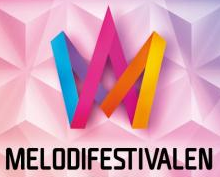
Finally now, in 2016 and as Christer Björkman and his team finish the details for the next edition we´ve known that a new image is coming to the competition. Starting with this re-imagined crown, the logo sees its biggest change since 2002 , still vaguely resembling a crown but in a more innovative way, further details on to what extend this design change will be seen on the live shows remain to be released by SVT.